


02/10/2012

Sherapop
1239 Reviews

Sherapop
Helpful Review
2
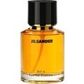
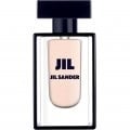
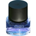
Consistent with the Concept of Pastel
I really love the packaging and bottles of the Jill Sander Style Pastels collection. Happily, the designer had the good sense to use not true pastels but green, yellow, and pink pastels to which a touch black was added, thus producing hues that just manage to participate in the oh-so-trendy palette which has held sway among fashionable folks for quite some time now and which I noticed just the other night was used in Michelangelo Antonioni's 1964 film "ll deserto rosso" in a brilliant presentation of industrial waste as aesthetically breathtaking. By now, of course, this palette has insinuated itself in the consciousness of hoi polloi and is everywhere on display. You know what I'm talking about: one woman I recall referred to the über-trendy green of this palette as “snot green,” and anyone who has suffered one of those horrible pneumonia-like flus in the midst of winter knows that she speaks the truth. But I digress...
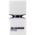
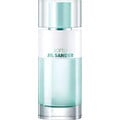
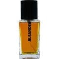
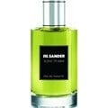
The bottles of the Style Pastels collection are geometrically perfect. They line up in a trio to produce a multiply interpretable sculpture of sorts. The vessels themselves appear to be made of a hard plastic which has been covered with a matte ceramic facsimile. In fact, upon clinking it emerges that only the caps are plastic (though still hefty)--the bottles clink when clicked, so they are actually constructed of glass. Anyway, I love the texture and the overall effect. Even the boxes are beautiful. Sadly, the only thing that I'm not entirely crazy about are the contents.
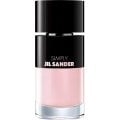
BLUSH PINK, in particular, is not a very appealing perfume to my nose. Each time that I wear it I am reminded of my orthodontist's office back when I was a pre-teen. This is a linear generic floral composition with a decidedly non-perfumic demeanor. It really smells to me like an air freshener or perhaps a “Feminine deodorant spray”. I cannot say for sure in the latter case, since I've never actually purchased any of that product, but I've smelled plenty of air fresheners in public places and offices such as that of my orthodontist. I finally took a peek at the data on this collection and discovered that the perfumer was Bernard Ellena. What a disappointment this was to learn, as I have truly loved some of his creations. In this case, he appears to have agreed to work with the pastel concept, and the results were perhaps predictable.
The bottles of the Style Pastels collection are geometrically perfect. They line up in a trio to produce a multiply interpretable sculpture of sorts. The vessels themselves appear to be made of a hard plastic which has been covered with a matte ceramic facsimile. In fact, upon clinking it emerges that only the caps are plastic (though still hefty)--the bottles clink when clicked, so they are actually constructed of glass. Anyway, I love the texture and the overall effect. Even the boxes are beautiful. Sadly, the only thing that I'm not entirely crazy about are the contents.
BLUSH PINK, in particular, is not a very appealing perfume to my nose. Each time that I wear it I am reminded of my orthodontist's office back when I was a pre-teen. This is a linear generic floral composition with a decidedly non-perfumic demeanor. It really smells to me like an air freshener or perhaps a “Feminine deodorant spray”. I cannot say for sure in the latter case, since I've never actually purchased any of that product, but I've smelled plenty of air fresheners in public places and offices such as that of my orthodontist. I finally took a peek at the data on this collection and discovered that the perfumer was Bernard Ellena. What a disappointment this was to learn, as I have truly loved some of his creations. In this case, he appears to have agreed to work with the pastel concept, and the results were perhaps predictable.