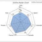
Those challenging radar charts
kept me busy, immediately. I went to the Public Library and bothered the Information Desk clerk. "Radar charts", what is this? A quick google search produced the explanation from Wikipedia. Okay, let's look. She came up with a simplified book, all about symbols, logos, illustrations and various ways of charting. There are bar charts, pie charts, and of course, radar charts. These three seem to house stationary information. When the information moves, a time line is the other element of charting. And then there is the Gantt chart, oh my ...
My copious almost daily way of bookkeeping would love an appropriate chart. If there is no such model chart available with computer software - at least I don't know about it (I don't use Quicken) - maybe it can be done manually. And please, make it as easy as if it were used by a twelve year old.
To account for expenses, one would have to collect the information over a period of a month, and then produce the picture first in a Bar Chart. Using "Groups and Categories". Using Rent, Car, Insurance, Gas and Electricity, Food, etc. etc. as Fixed Expenses, and the others ... clothes, vacation, dinner out, and did I say - PERFUME - are the discretionary expenses. Each household is of course different. Not to mention, Savings and Investments. College Fund. IRA and Pension. And so on, and so on.
The Bar Chart then gets the results at the end of the first month of charting. The height of the Bars show the dollar amounts. Easy. It would be good to group certain expenses with the arrangement of the Bars.
Now - here it comes - now convert the information into the Radar Chart presentation. The Radar Chart has a center and there is the value of Zero. At the end of each individual spoke is the Highest Value. This time in dollars. So - plot away! I have yet to test it out ... One has to begin with the highest value of all information to establish the end of all individual spokes radiating from the center point of zero. And then the order of the groups (categories) is important. However, better than nothing. Next month, do that again. Will the results remain the same? Probably not. Like jell-o, they move. The structure is the spoking system of the Radar Chart, and over time, the image changes.
How good a way of evaluating money expenses is this? I don't know. I love to play, however, and also to get a grip on my expenditures, as sometimes they impulsively and wilfully flow out. Surely this is the case with perfume purchases, I am not denying it. I have said in the past that I would rather go hungry than curtailing the pleasure of good and costly scents, niche scents ("break the bank").
Charts will not hem in the perfume passion, no matter in which rendition. That is a topic for further discussion. Something to muse about ...


 Pipette